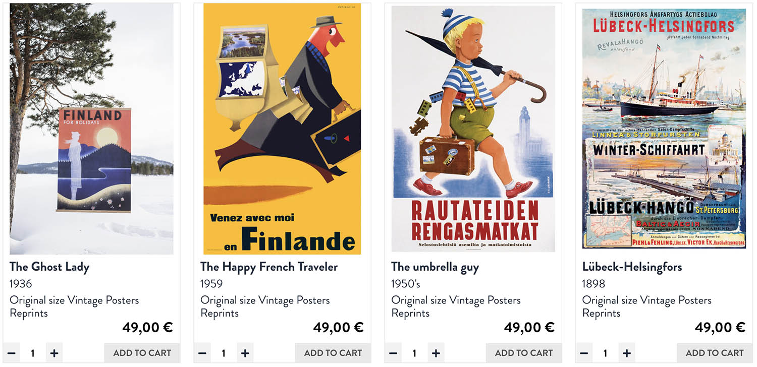
The idea behind Come to Finland is wonderful: a poster shop selling reprints of design classics of Finnish travel posters, and products based on these.
Many of the original travel poster designs are witty, beautiful. There is a lot of minimalistic 1930’s and 1950’s designs that are at the same time elegant and fun. After seeing the posters, any design enthusiast should feel obliged to book some tickets for a holiday to Finland.
KRUT’s role: project management, UI, product data design
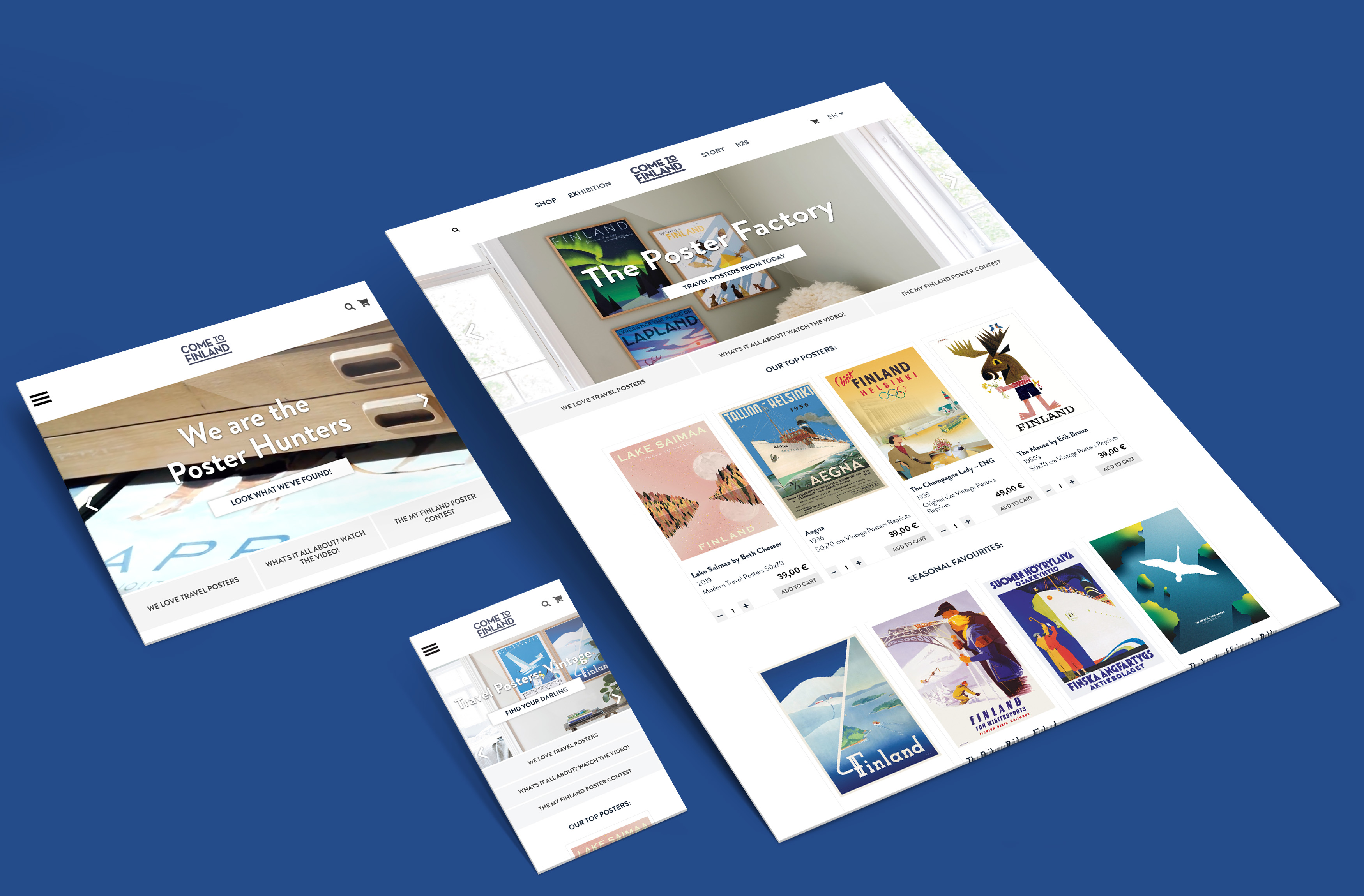
The company needed webshop, and KRUT was given the task to make this happen. More specifically, our tasks became: project management, UI prototyping (we used Sketch this time), defining website specifications and features, cleaning the product data and defining its set-up and choosing a technical partner. We explored different webshop and website plattforms. Due to the advanced features that were required, we chose the solution to be WordPress/Woocommerce and Site Logic as partner to build it and collaborate on final specifications.
Features: minimalism, product filtering, design history
So, what did we want to achieve?
• The atmosphere of the poster classics is echoed in our minimalistic web design of the shop.
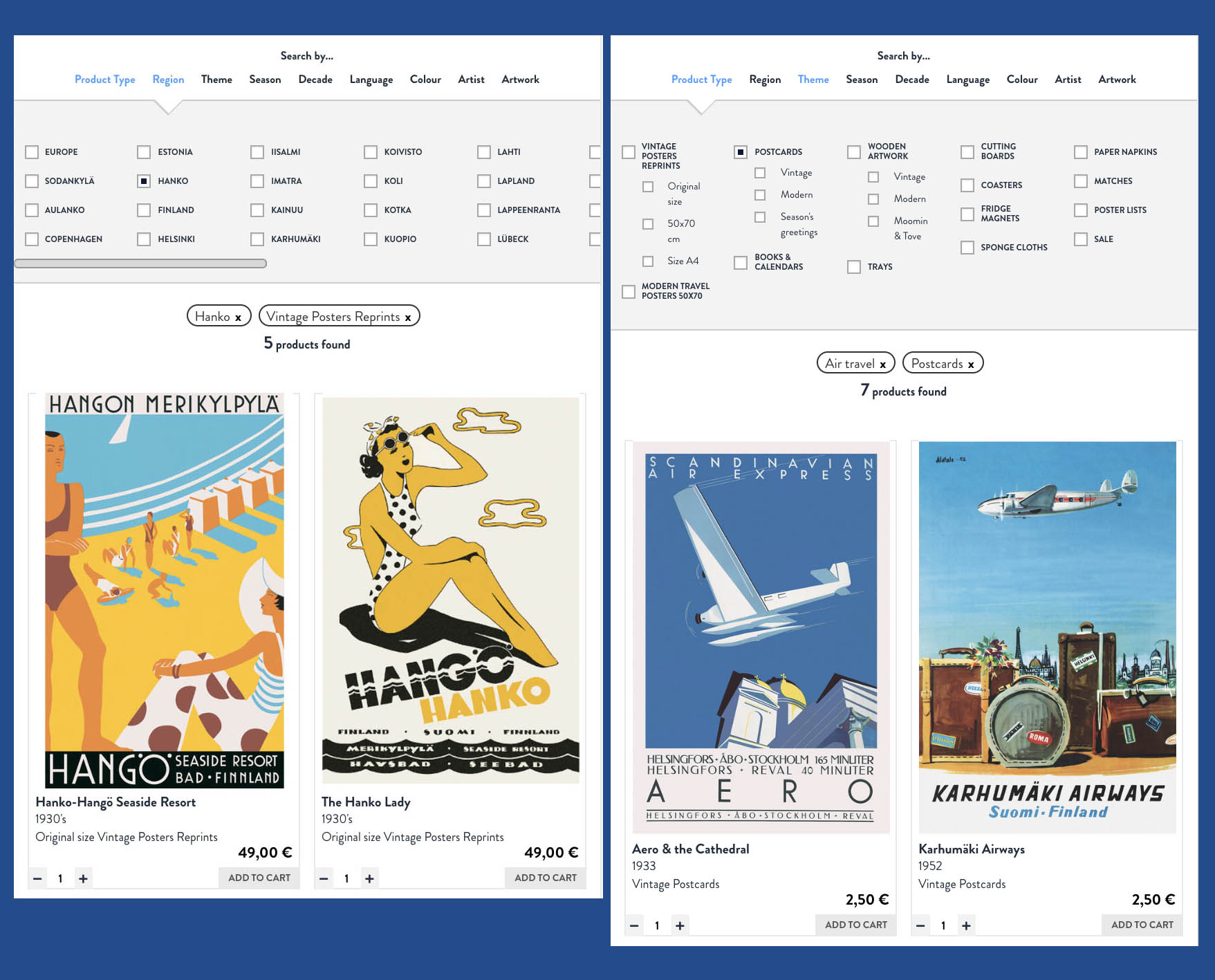
• To present the vast collection, KRUT Collective did some work on the product catalogue, so the visitor can find products according to their own area of interest in a product filter:

- The project included a design for the sister company Come to Sweden, with same style and pairing colouring.
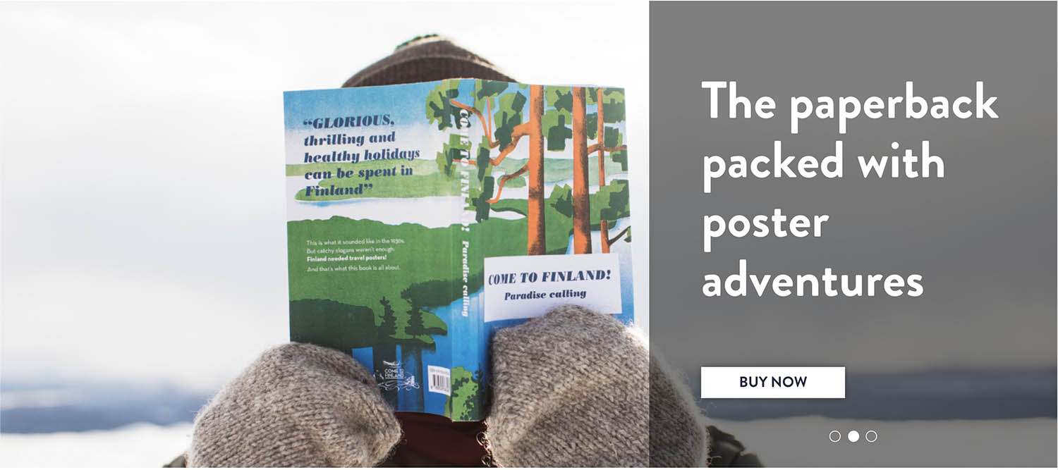
- The products were sorted according to the original poster author and original poster artwork. A hidden gem for any art history enthusiast are the poster stories and background information on the artists and poster designs. These are found on complete artist and artwork catalogues right along the web shop. Authors range from Erik Bruun and famous marketing agency SEK co-founder Jorma Suhonen to less known ones and even contemporary artists. All information is based on the research by journalist Magnus Londen.
This final part made the project special for us – alongside selling produts, it was much also about laying out information on design history.
Our UI design also highlights the beautiful product photography by Karin Lindroos. She’s taken the products with her to the real settings all from Hanko and Lapland.


An important final analysis was made: does it spark joy?
