This is information design
Infographics, charts, diagrams, explanatory graphics, dataviz, visualisations… There’s a wide array of terms and names for work that we call information design. If you’re looking for a picture that explains for example an abstract concept or visualises data or statistics, we can deliver planning, research and final execution. We also do report designs and production (see art direction).
In visualisations we strictly follow the principles of minimalism and functional design. It’s based o the idea that Every shape, colour and design choice communicates something. A key part of our assignment is understanding the material we work with and work out the most relevant way(s) of presenting it visually. Our aim is to make every infographic we deliver functional, truthful, beautiful, clear and accessible to all.
We will ask you all the questions needed to fulfil our part of your project. We communicate clearly with you about deadlines, prices and requirements – you can even leave managing the project to us.
Every project has its individual needs. Our information design projects range from small to big, repetitive to one-off gigs. Sometimes we join in at a late stage on a well-planned project, sometimes we give consultation at the grant application or preliminary budget planning stage of a project.
Sometimes your solution is not a single image, dashboard, or a series of infographics. Maybe laying out a concept or finding the right form is the job, and our role can be the one of advisory consultant. We apply information design thinking to every aspect of our work. We look forward to solving your visual challenges!
So, what do I actually need? Where should I start? We offer a free consultation session for anyone planning to set up a visualisation project of any size.
Visualisations and information design references:
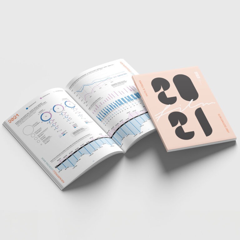
Facts and figures – a yearly report can look like a magazine
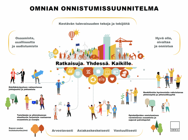
Strategy visuals – case Omnia
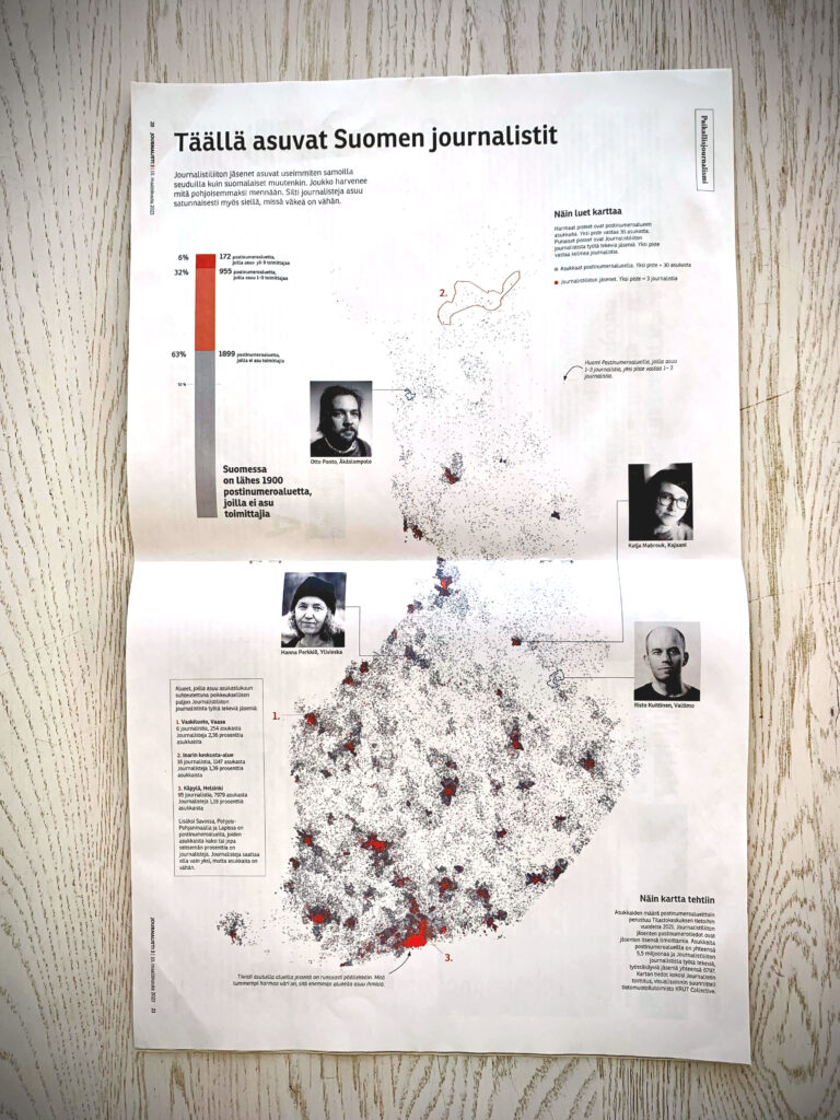
Where do Finnish journalists live? A dot density map
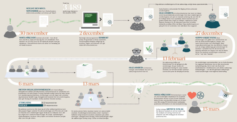
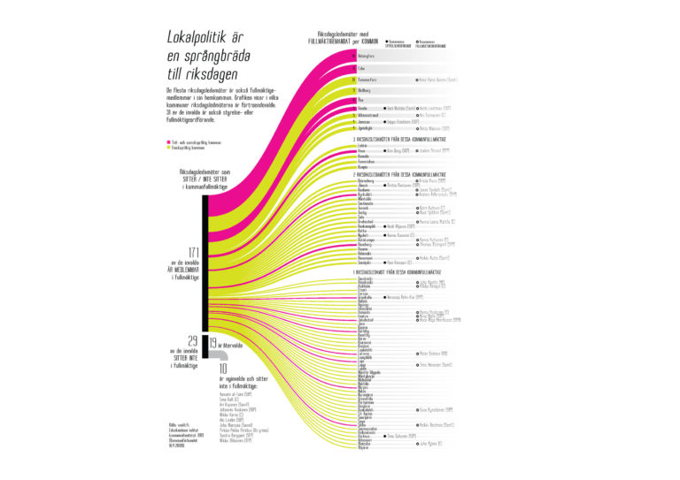
Flow chart for Svenska Kulturfonden
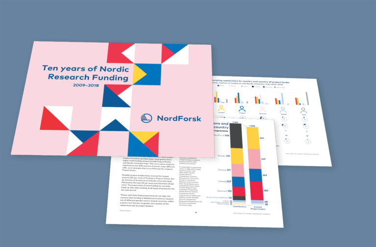
Visualizations and report design for Nordforsk