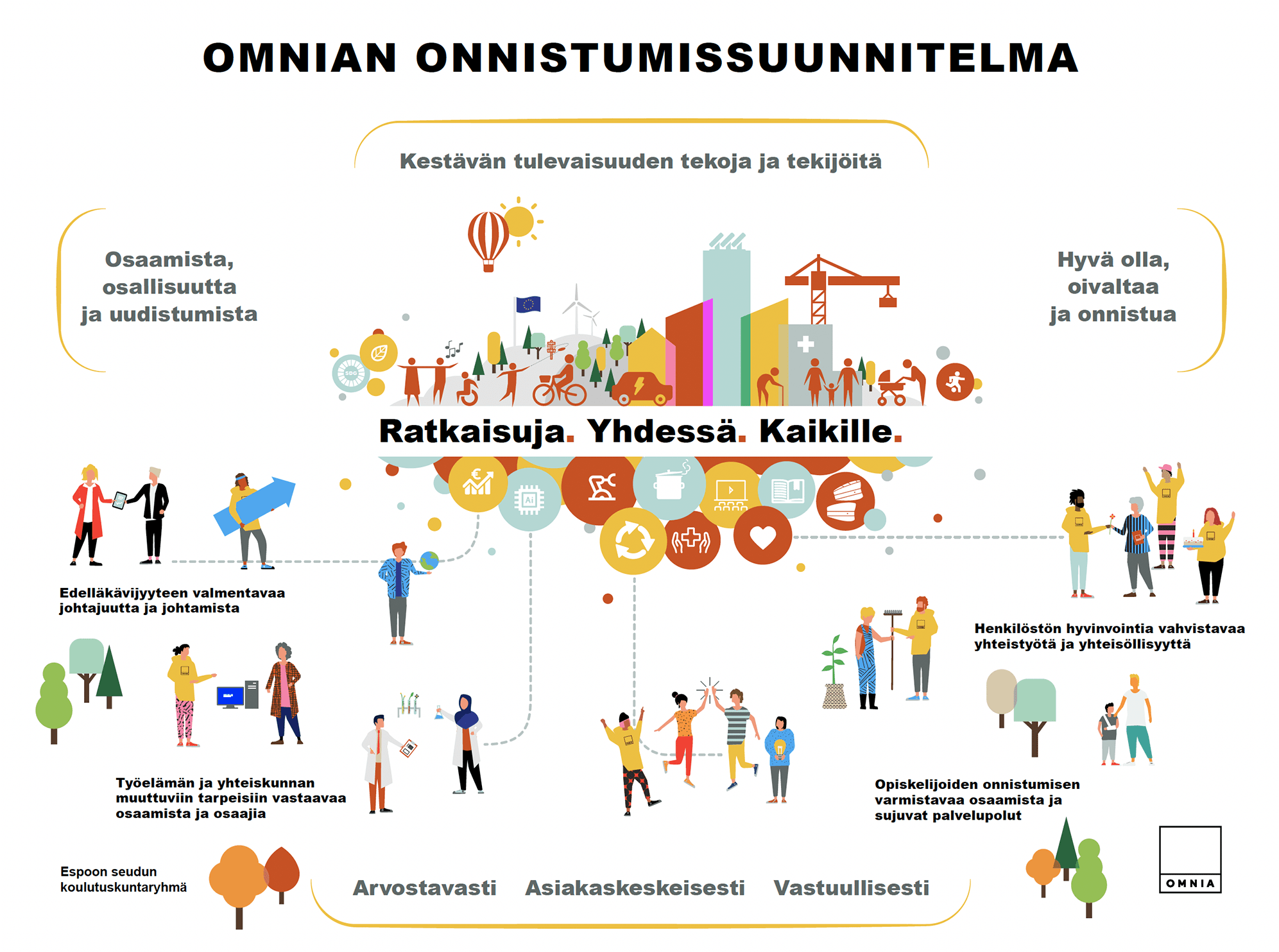
We’ve learnt a lot about information design when creating strategy visuals for public organisations and large-cap public companies in the last years. Above is one that the educational organisation Omnia has used since September 2022. In its strategy, the organisation strives to educate students, teachers and others to become those who contribute to a sustainable future.
Some insights from the different assignments have especially been:
- How to illustrate abstract concepts, ideas and goals through concrete examples.
- How to handle the process: understanding the needs, involving decisionmakers in the process and taking decision without getting stuck. This is mostly about:
- Setting up a clear timeline and objectives for its steps, right at the start.
- Figuring out one thing at the time, establishing common decision with a working group at regular intervals. This is much about knowing when to re-evalute ideas from earlier – and especially when to stick with what has been decided earlier on.
- How to handle a piece of illustration as a tool to guide its users, rather than an artistic piece. It needs to help its users in their everyday – that said if nobody is engaged or inspired by its story or its aesthethics, the tool might become useless.
A strategy visual is a lot about sensemaking. What are the goals and how do we win them? What is the big picture and where do i as an employee, leader, shareholder or client, fit into it? While visualising what the goals of the organisation are, it is also important that everyone can position themselves and their role in the visual, for it to have real impact.
