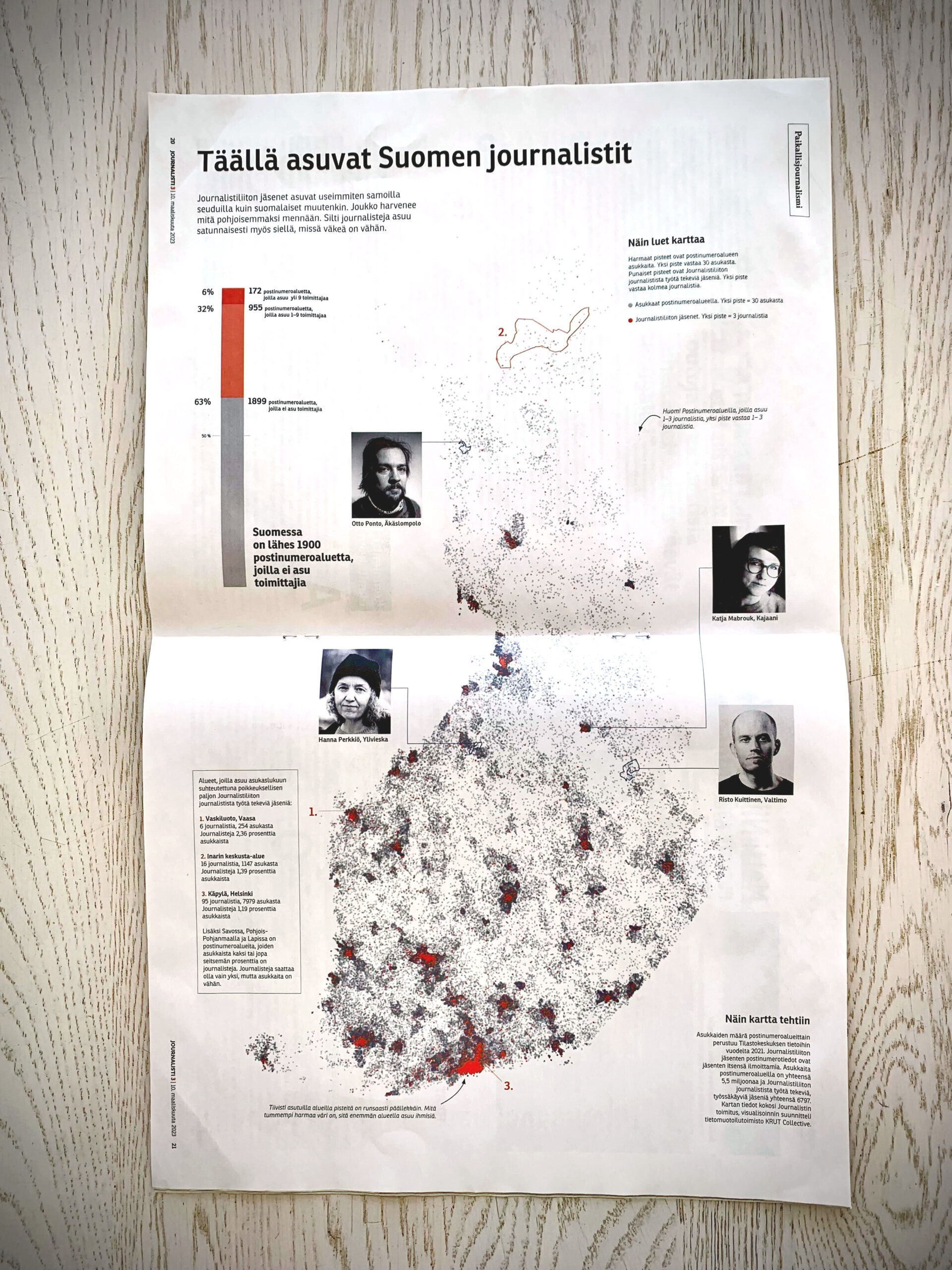
Exploring alternatives to choropleth maps (maps where areas are filled with colours according to data), we decided for a dot density map for Journalisti magazine, by the journalists’ union in Finland Journalistiliitto Journalistförbund.
- The data: population by postal code, journalists (union members) by postal code, postal code area borders.
- Each grey dot represents 30 inhabitants. The dots are placed randomly within each postal code, and are slightly transparent, so more densely populated areas get darker.
- Each red dot represents 3 journalists.
This way, the greys make a population density map and the reds show where especially many journalists live. We realised this also draws out a quite recognisable map of Finland, so we left out the basemap. We love that we got to use a full magazine spread, turned 90 degrees.
One insight visualised: Finland is a large country with few inhabitants, and there definitely are “blank spots” with no journalists around. Anything else you might spot here?
More details on the work process can be found on its Information is Beautiful Awards 2023 contest entry page.
